User Interface
Practical step-by-step guide for using KPG View to visualize and analyze power system networks.
1. Top Bar
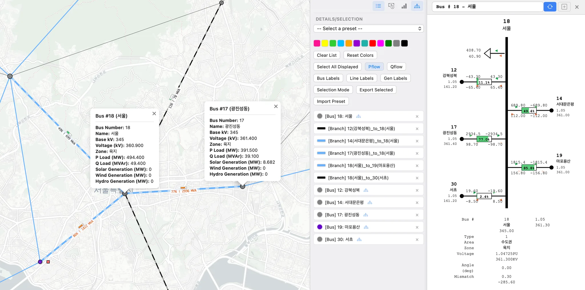
☰ Layers button: toggles the Layers panel, where you configure what to display on the map.
File: click to select a result file (e.g.,
*.geojson).The currently loaded file name is shown next to the Open button.
Folder: click to select a folder which includes the result files (e.g.
*.geojson).For time-series results, the app may ask you to select a results folder to load time-series data.
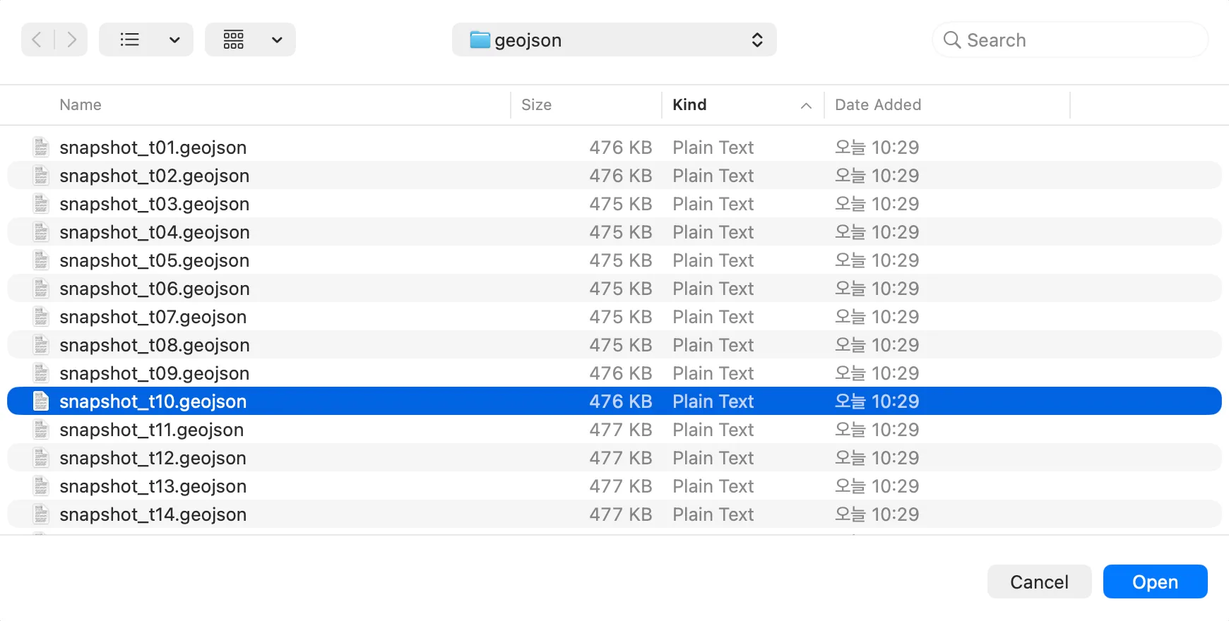
Time-Series Playback (24h): When you load a time-series result (e.g., a 24-hour simulation), KPG View provides playback controls at the top of the map so you can review hours 1 → 24 continuously.
Timeline slider: drag to scrub to a specific hour (frame) and instantly update the map.
Play / Pause: animate the results over time.
Step controls (◀ / ▶): move one hour backward/forward.
Hour indicator (e.g.,
1 / 24): shows the current time step and the total number of steps.Loop: repeat playback from the last hour back to hour 1.
Speed (e.g.,
2x,1x,0.5x): control the playback rate.
Search: use the search box to quickly find and zoom to network elements.
Bus: search by bus name or bus ID/number
Branch/Line: search by line/circuit ID or from/to bus ID (From/To)
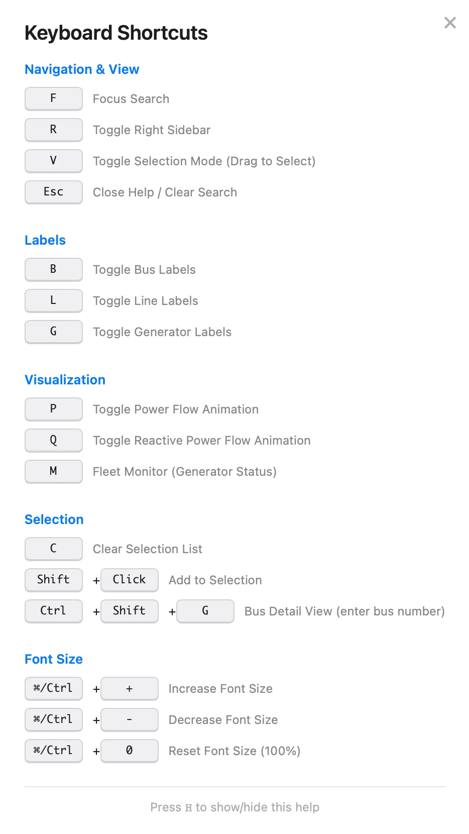
Help: opens a keyboard-shortcuts panel (press H to show/hide).
Navigation & View
Labels
Visualization
Selection
Font Size
☰ Details/Selection button: toggles the Details/Selection panel, where you configure what to display on the map.
2. Layers
Feature Types
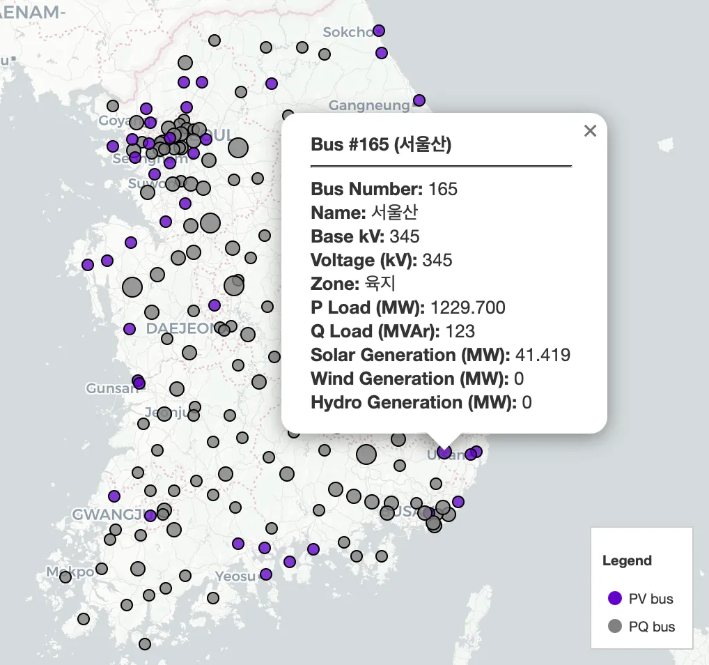
Bus
Enable Bus to display bus locations on the map.
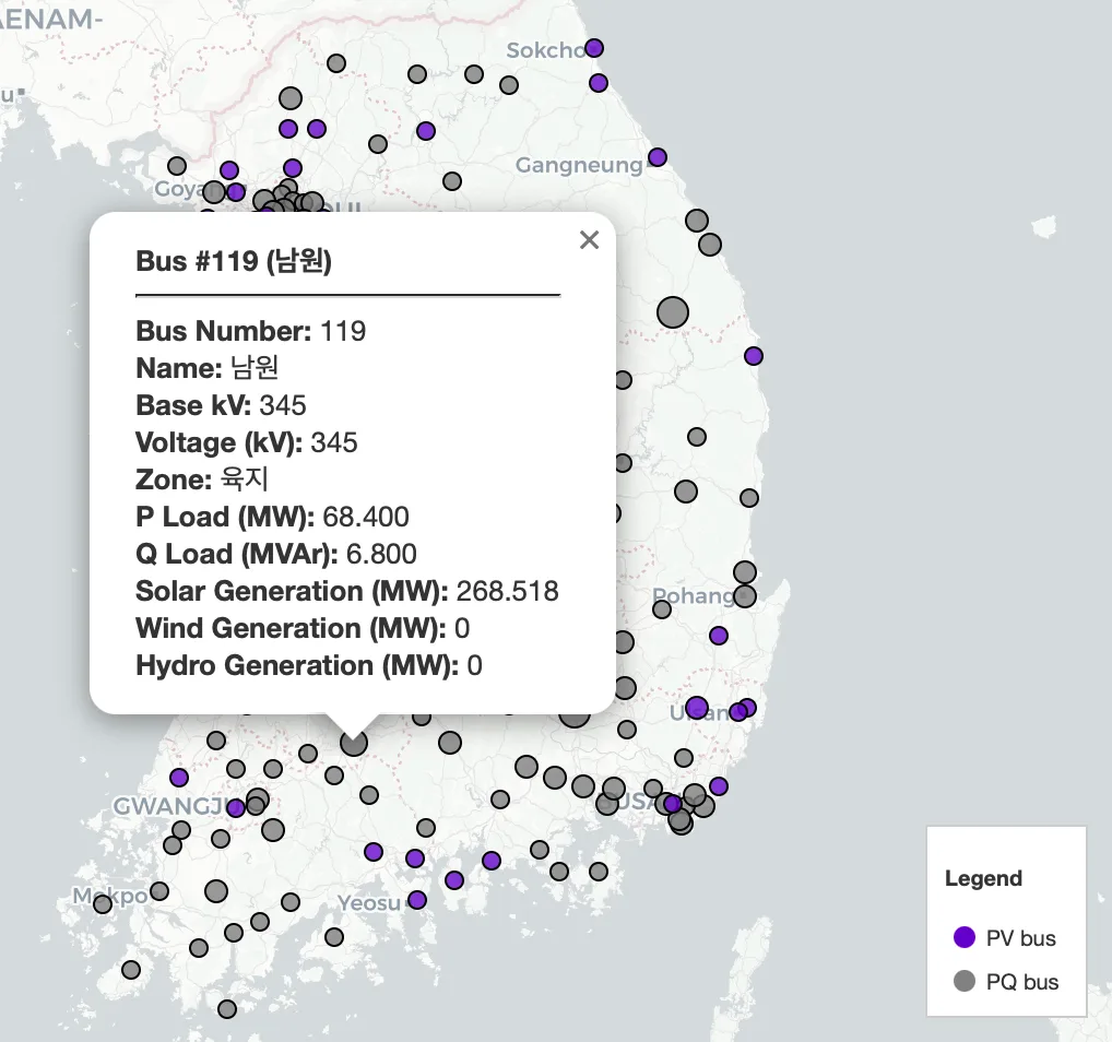
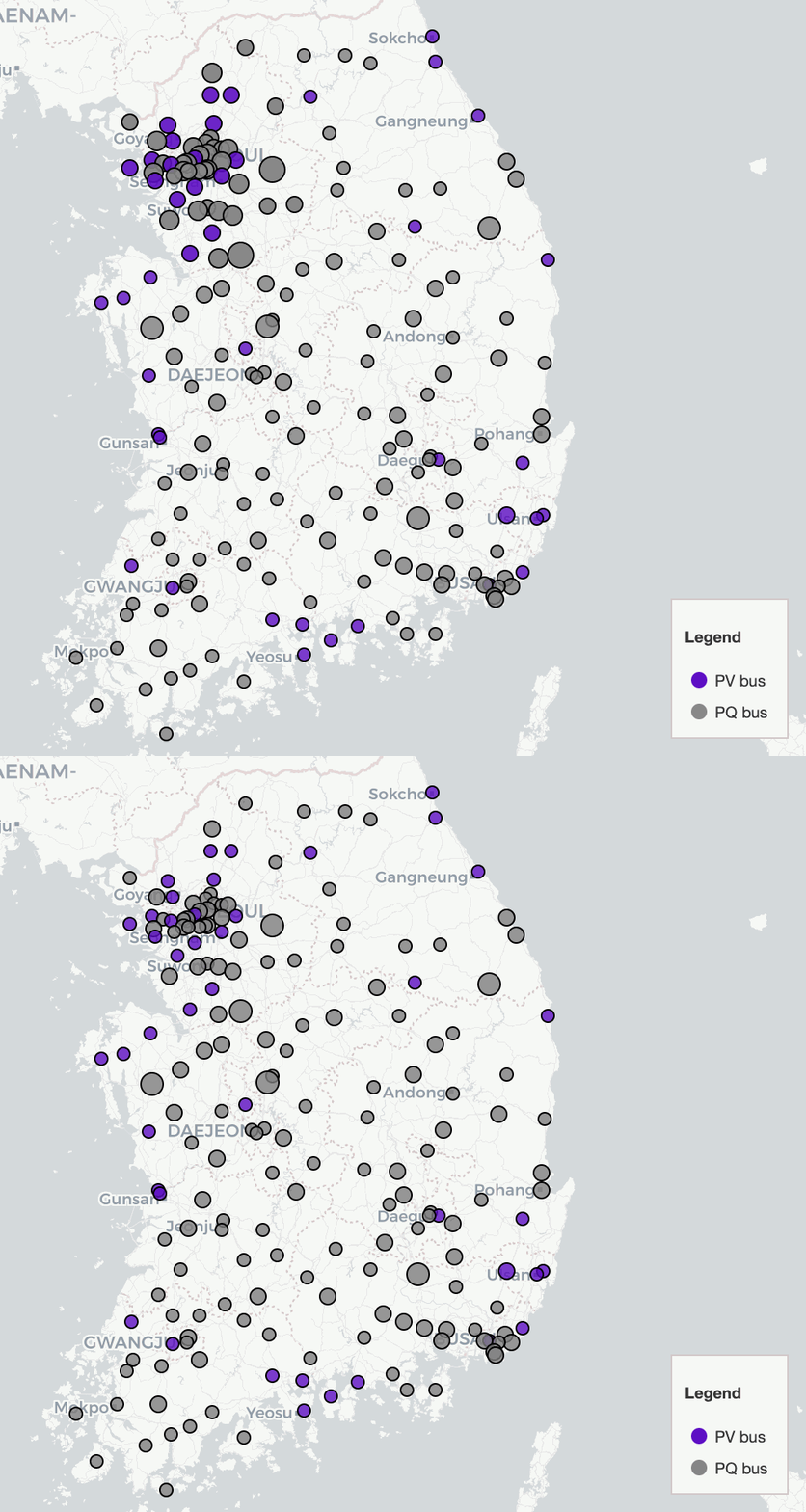
Buses are categorized as PV or PQ buses (the legend is included in the image below).
PV bus
PQ bus
Click a bus marker to open an information popup.
Bus Number/Name
Base kV
Voltage (kV)
Zone
Load (P/Q)
Renewable Generation (solar/wind/hydro) (when available)
Generator
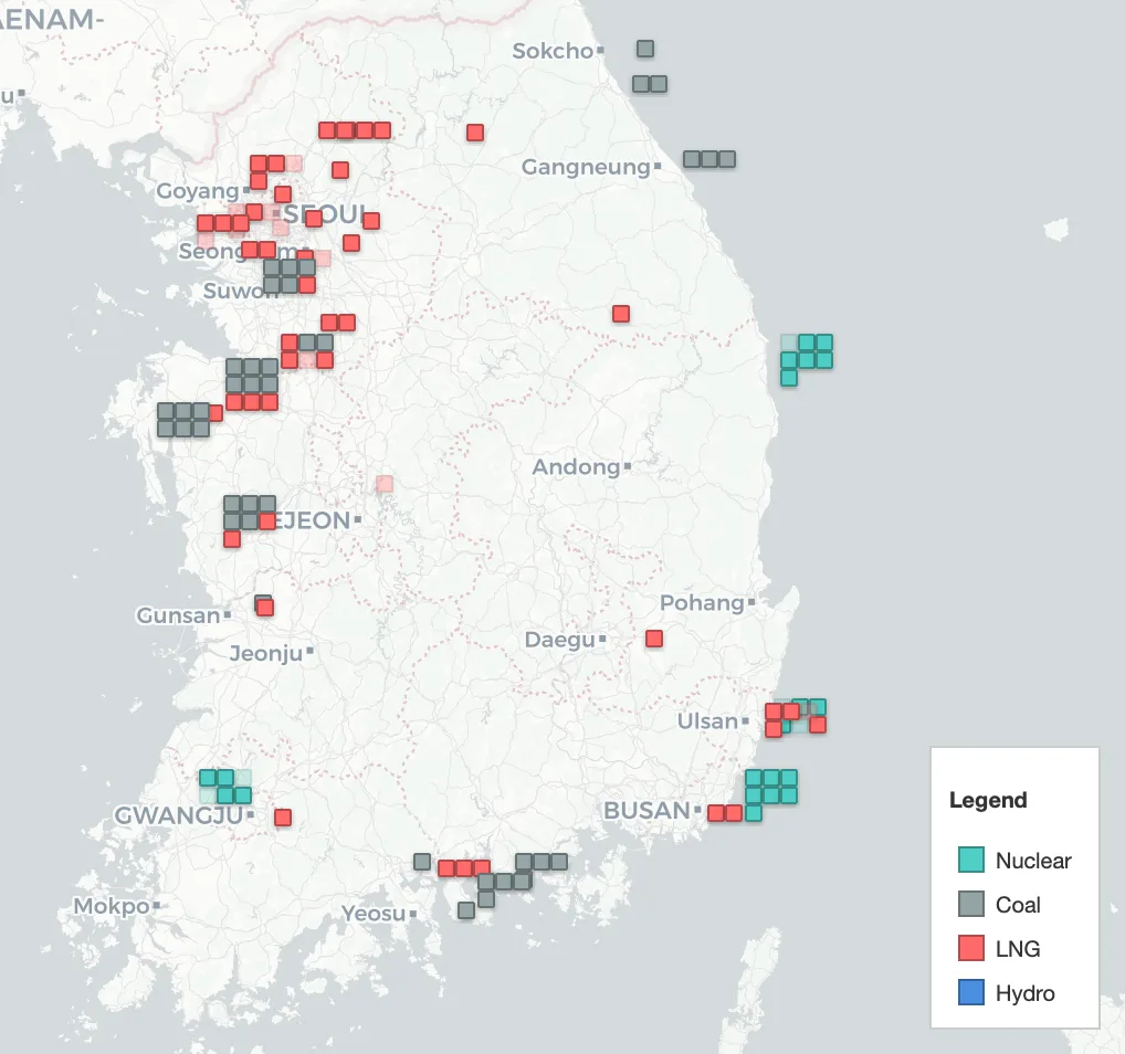
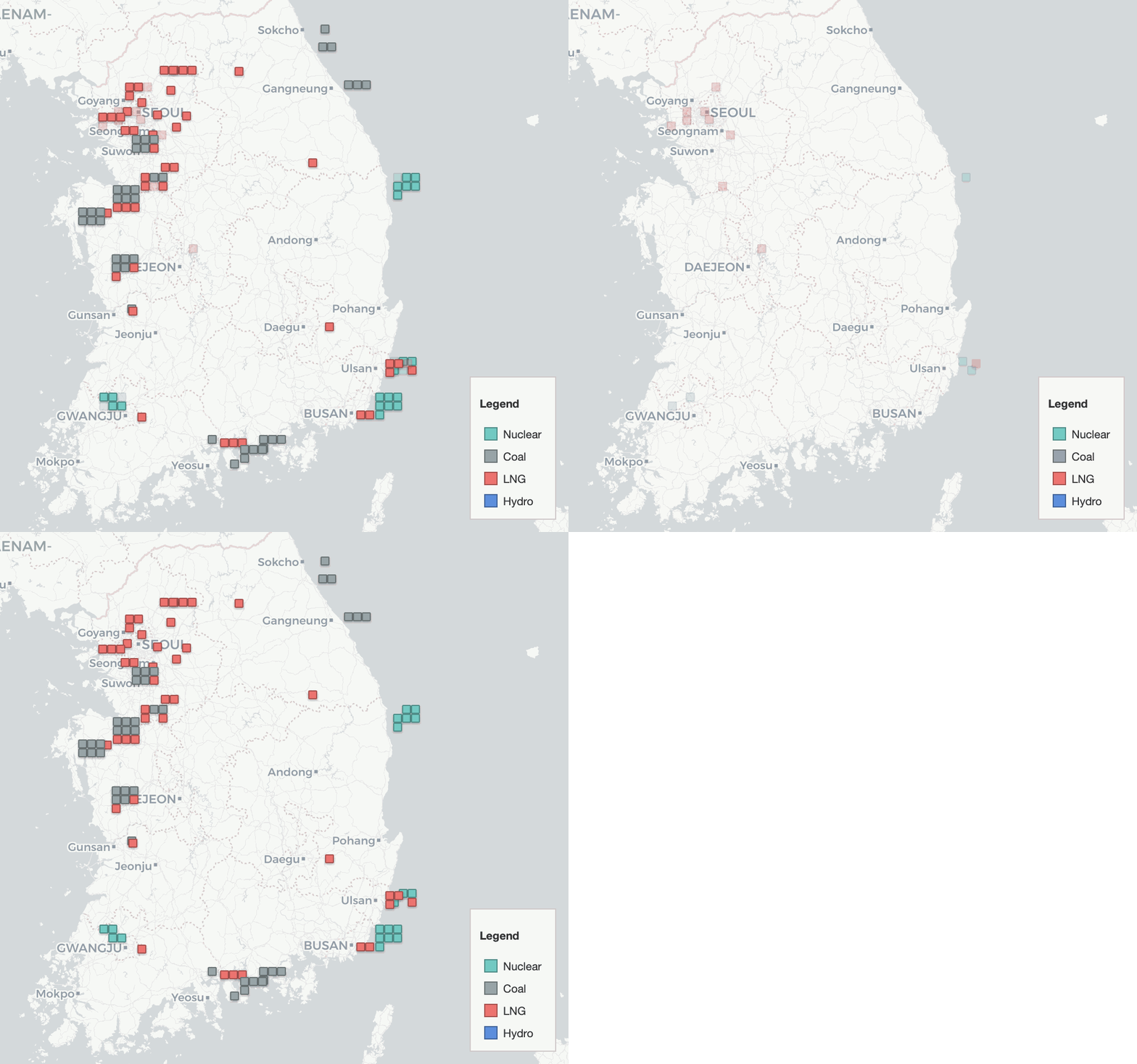
Enable Generator to display generator units on the map (square markers).
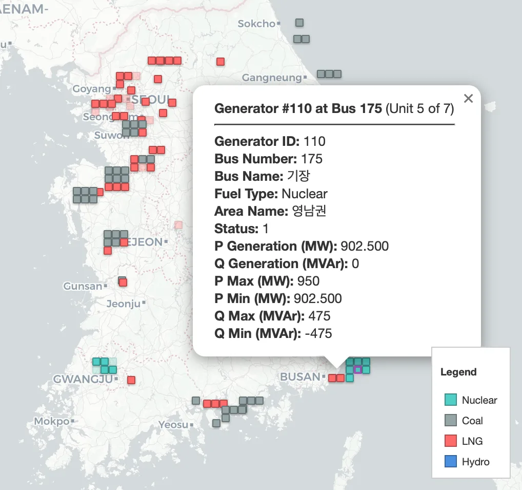
Each square represents a single generator unit. If you see a “stack” of squares at the same location, multiple units share the same bus/plant location (e.g., Unit 5 of 7).
Fuel types (Nuclear/Coal/LNG/Hydro) are indicated in the legend included in the image below.
A transparent marker indicates an offline unit (not committed /
Status = 0). A solid marker indicates an online unit (Status = 1).Click a generator marker to open an information popup.
Generator ID
Bus Number/Name
Fuel Type
Area Name
Status
P/Q Generation
P/Q Limits (Min/Max)
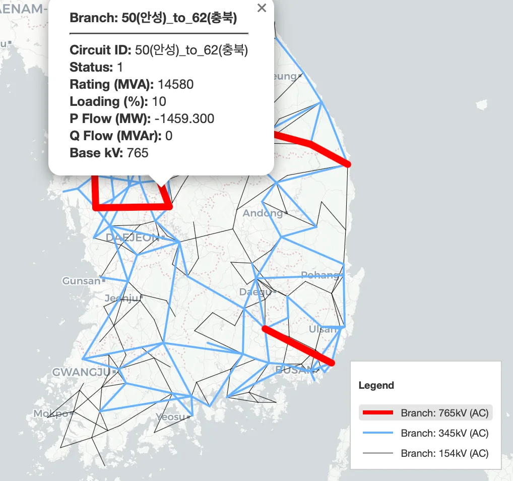
Branch (AC)
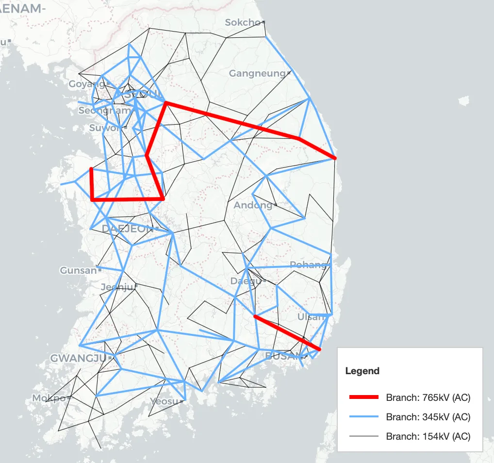
Enable Branch (AC) to display AC transmission lines on the map.
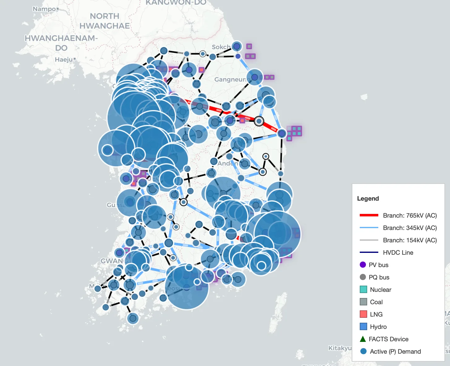
Voltage levels (e.g., 765/345/154 kV) are indicated in the legend included in the image below.
Click a line to open an information popup.
Circuit ID
Status
Rating (MVA)
Loading (%)
P/Q Flow
Base kV
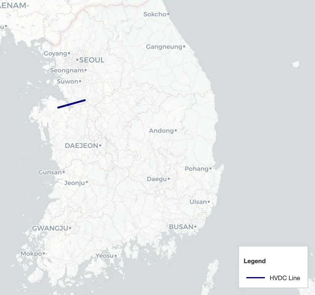
HVDC Line
Enable HVDC Line to display HVDC links on the map.
HVDC lines are shown as a separate layer, and the legend is included in the image below.
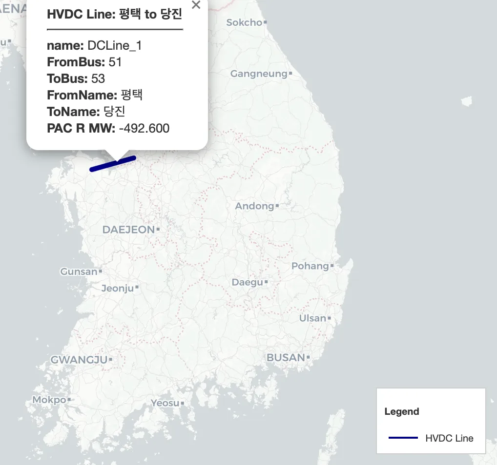
Click an HVDC line to open an information popup.
Name
From/To Bus Number & Name
PAC R (MW): HVDC power transfer value
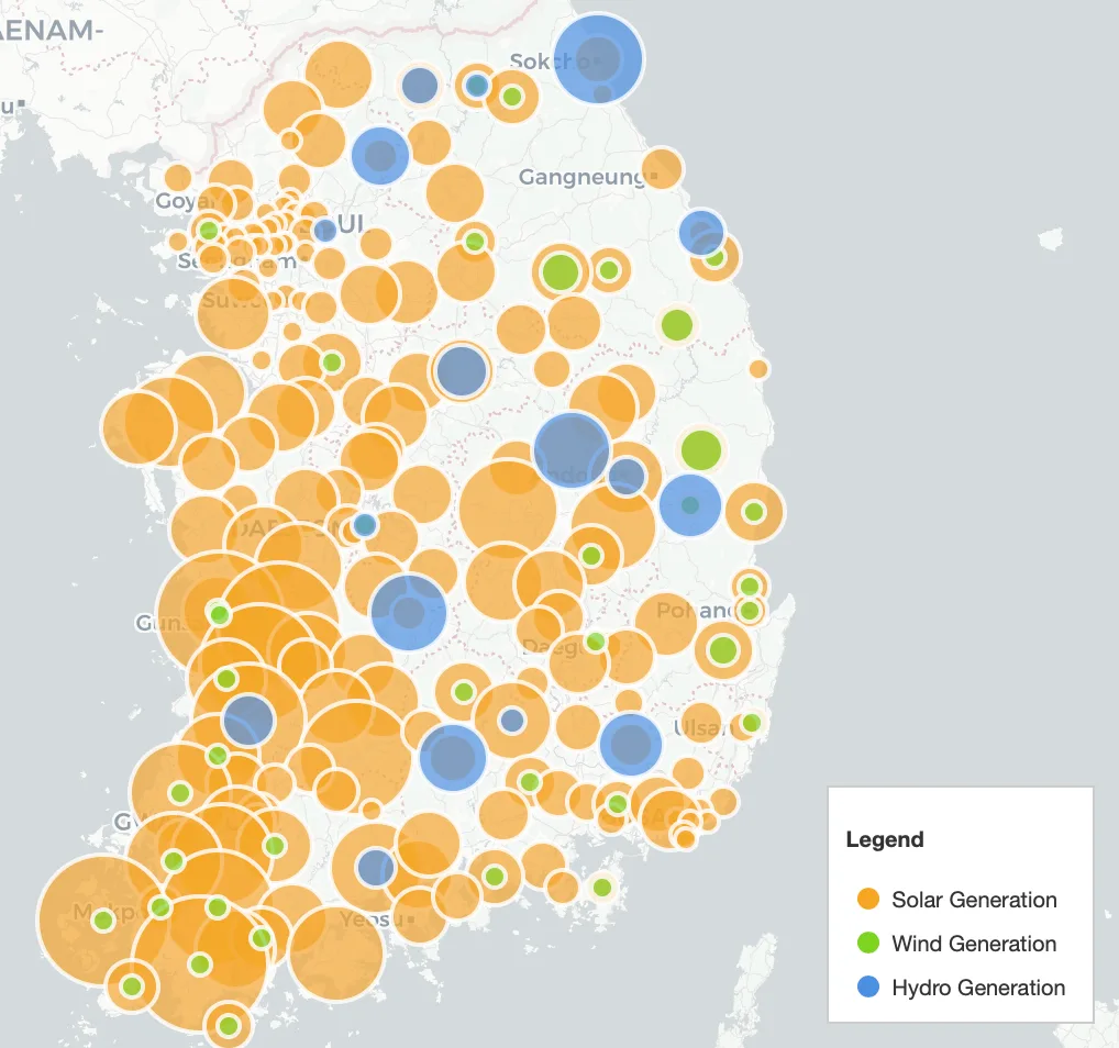
Renewable Energy Visualization
Toggles:
Solar
Wind
Hydro
The selected resource(s) are shown as circles on the map. (Circle size is relative)
Click a circle to open a popup.
Generation (MW)
Bus ID
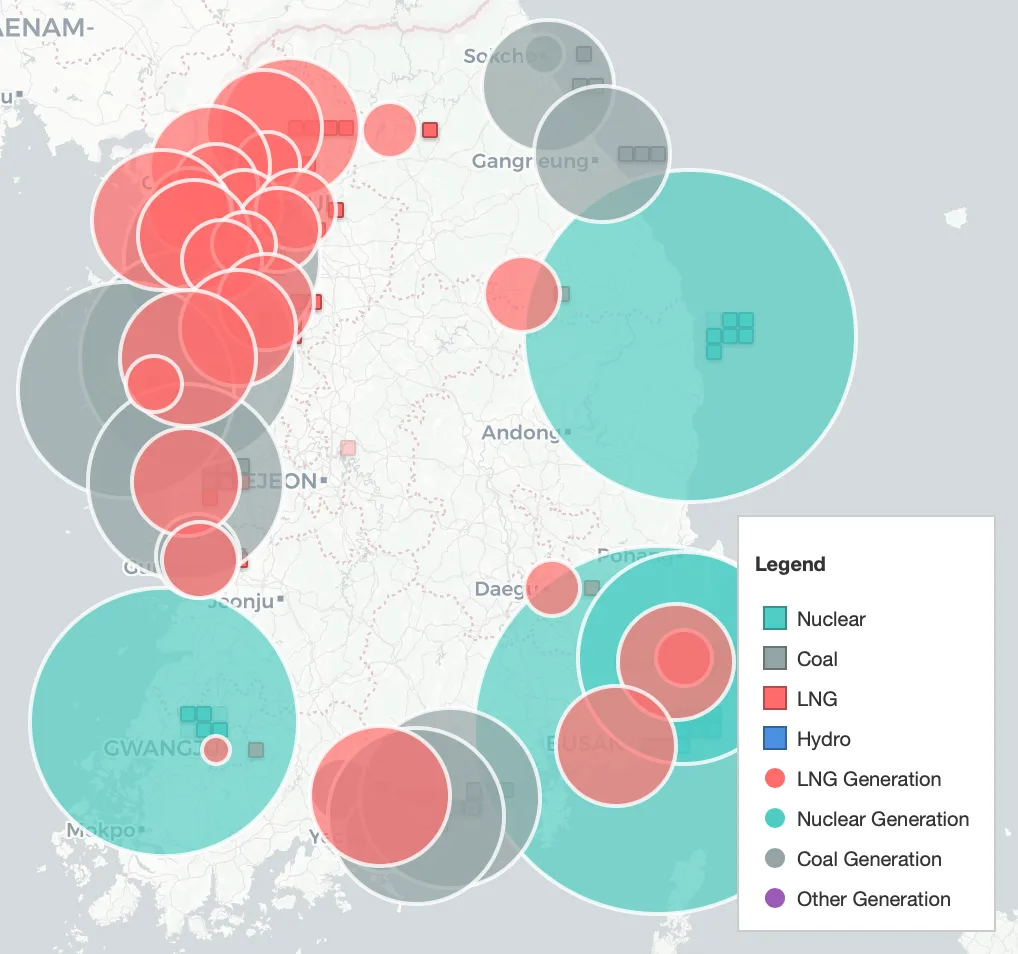
Conventional Generation Visualization
Toggles:
LNG
Nuclear
Coal
Other
The selected fuel category(ies) are shown as circles on the map. (Circle size is relative)
Click a circle to open a popup.
Generation (MW)
Bus ID
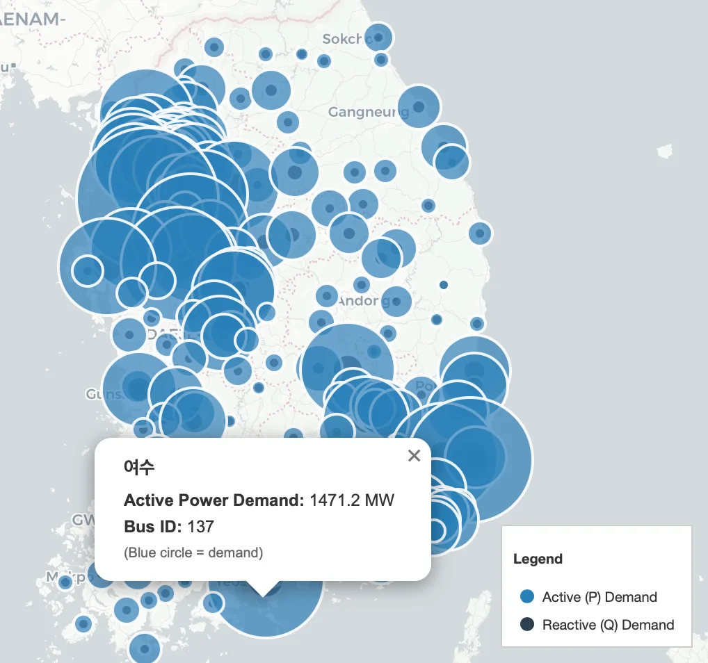
Demand (Load) Visualization
Toggles:
Active (P)
Reactive (Q)
The selected demand component is shown as circles on the map. (Circle size is relative)
Click a circle to open a popup.
Demand
Bus ID
Circle Size Scale
Use the Circle Size Scale slider to adjust the global scale of circle-based overlays (renewables, conventional generation, demand).
Increasing the scale makes circles larger; decreasing the scale makes circles smaller.
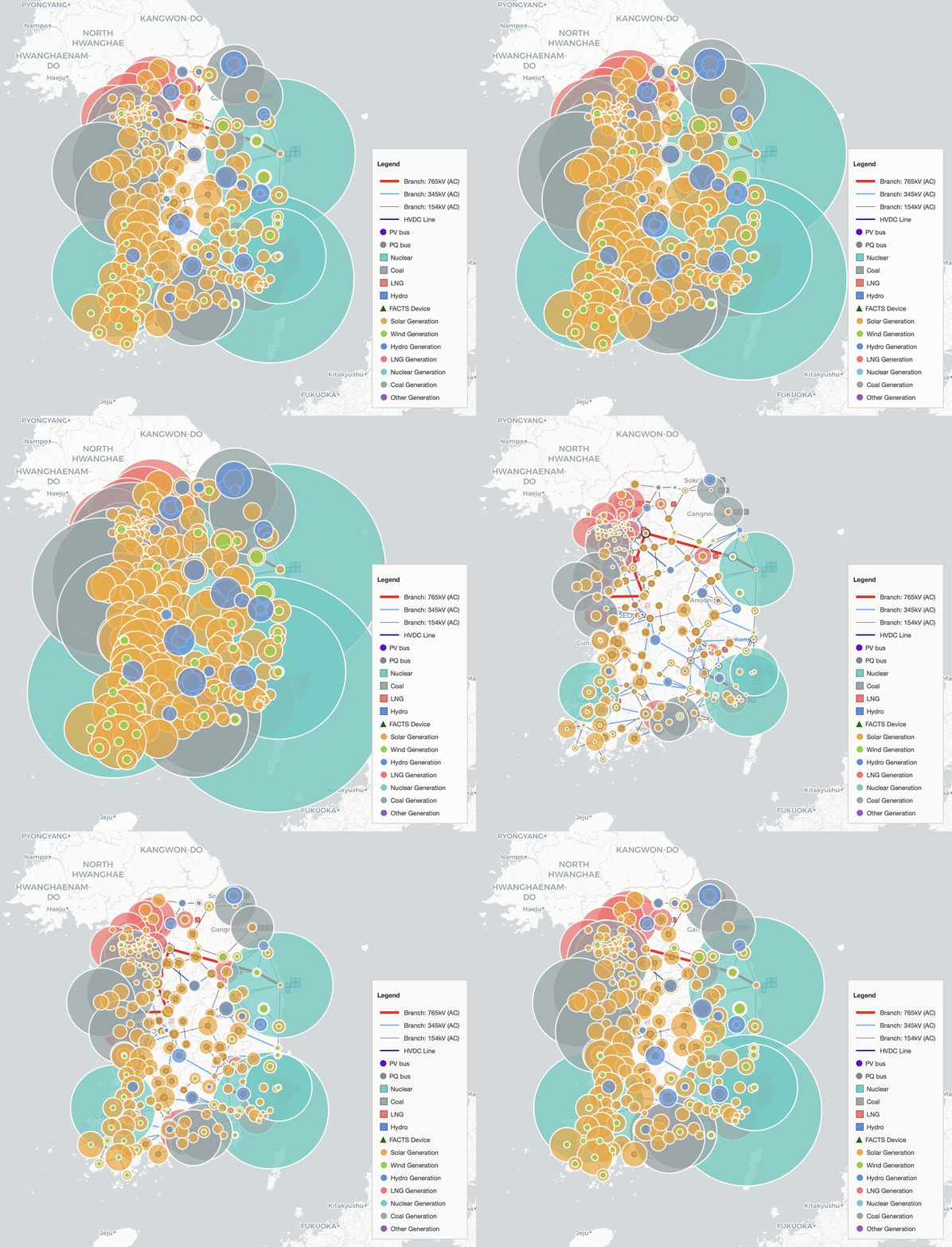
Example: adjusting the Circle Size Scale (50% ~ 150%) slider changes the displayed circle sizes.
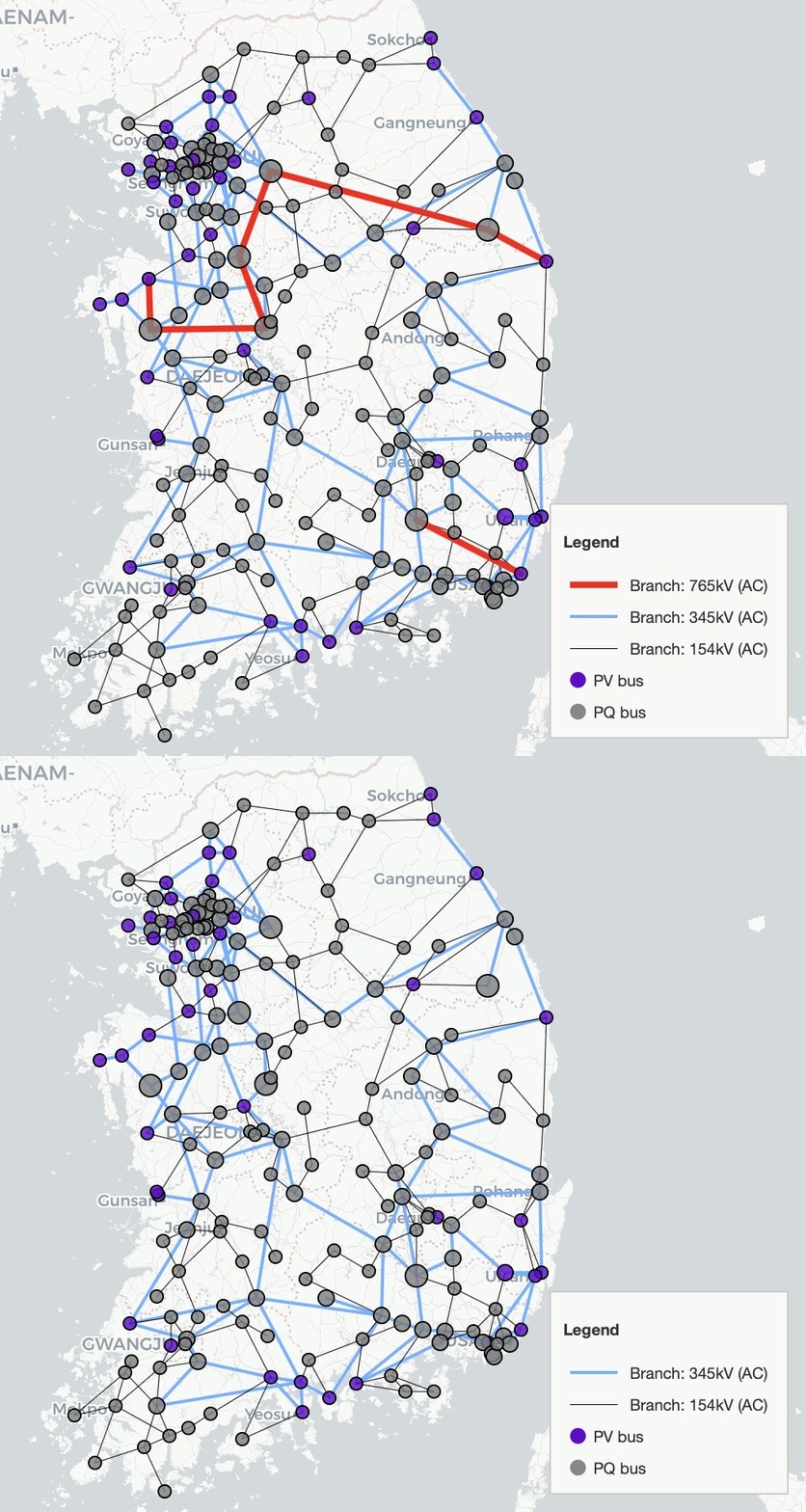
Line Voltages (Branch)
You can toggle which AC branch voltage levels are displayed:
765 kV
345 kV
154 kV
765 kV
345 kV
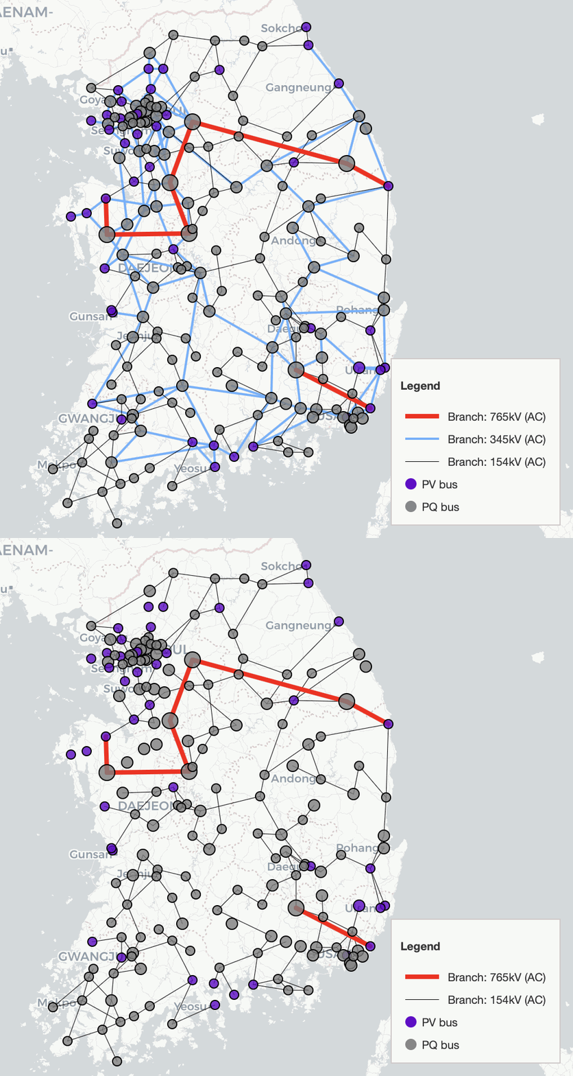
154 kV
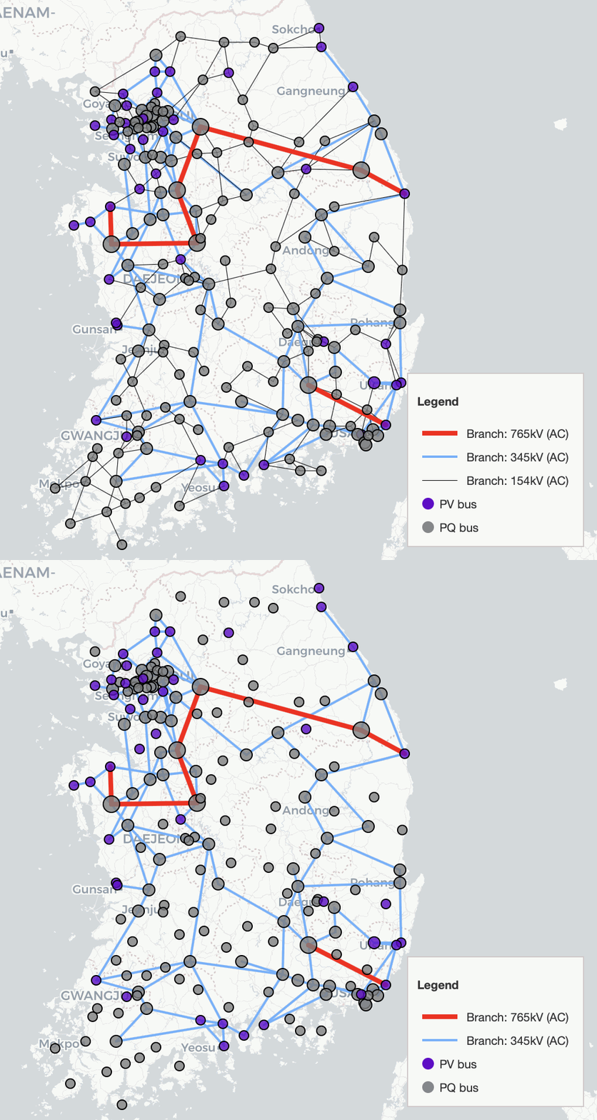
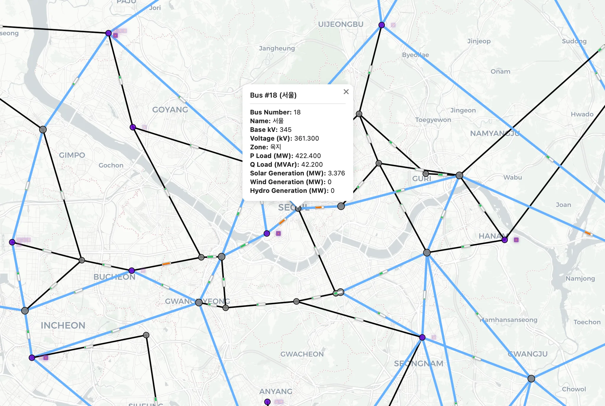
Line Loading
Loading Bars: loading bars on branches (bar size reflects Loading (%)).
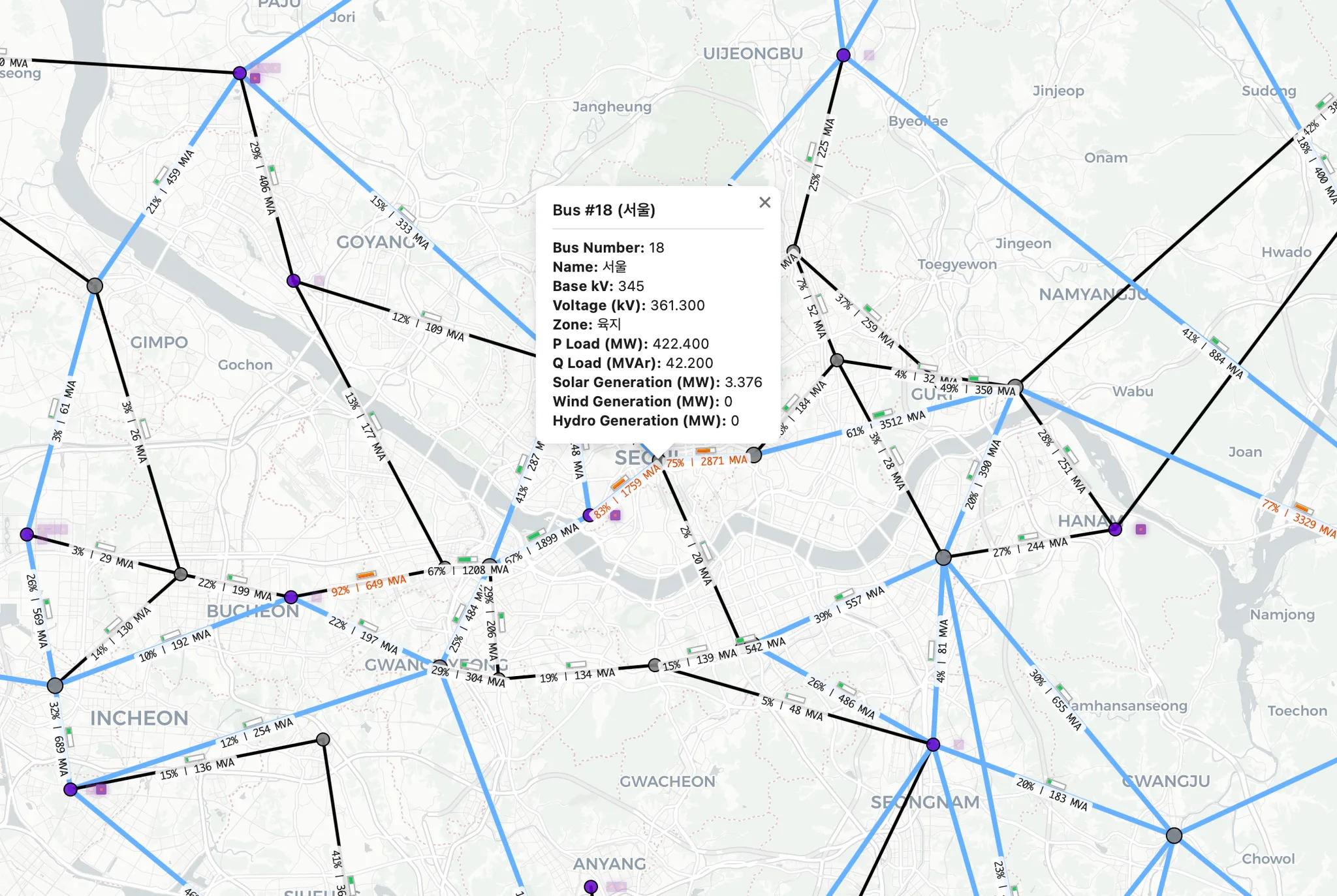
Labels: numeric branch values (e.g., Loading (%) and P Flow (MW)).
Loading (%)
P Flow (MW)
Selected Only: hide low-loading branches and display bars only above the threshold.
Loading Bars
Displayed Labels
Min Loading Threshold
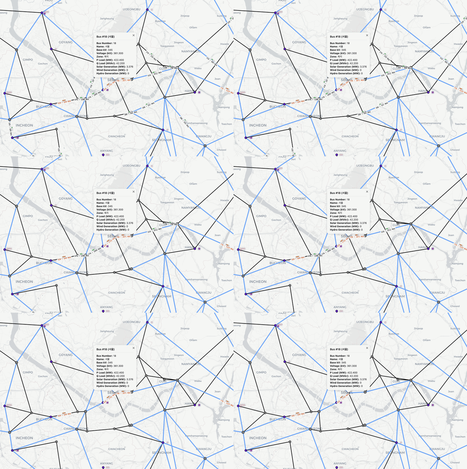
Example: adjusting the Min Loading Threshold (20% ~ 80%) slider changes the displayed Loading Bars.
Bus Voltages
You can toggle which Bus voltage levels are displayed:
765 kV
345 kV
154 kV
765 kV
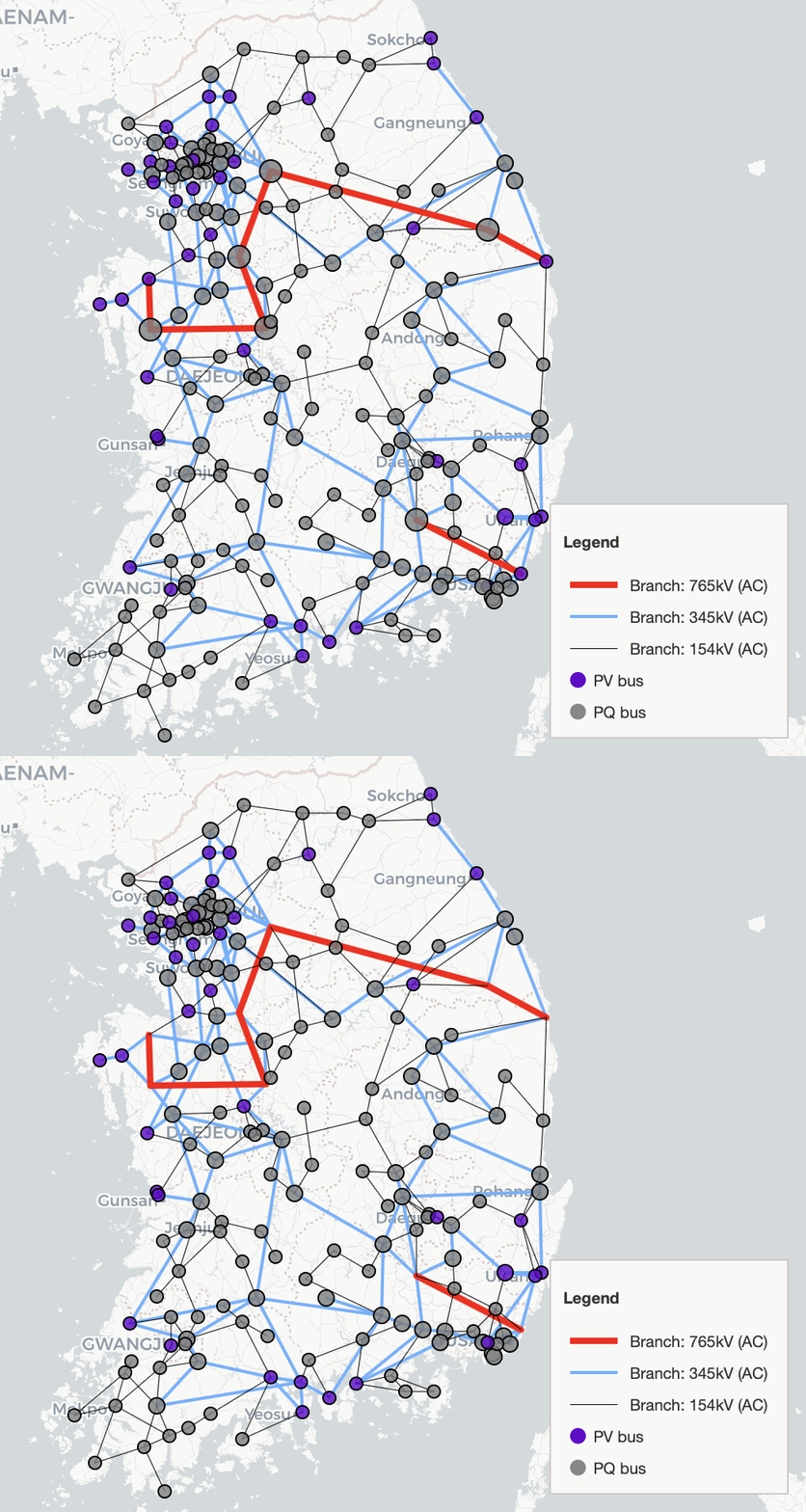
345 kV
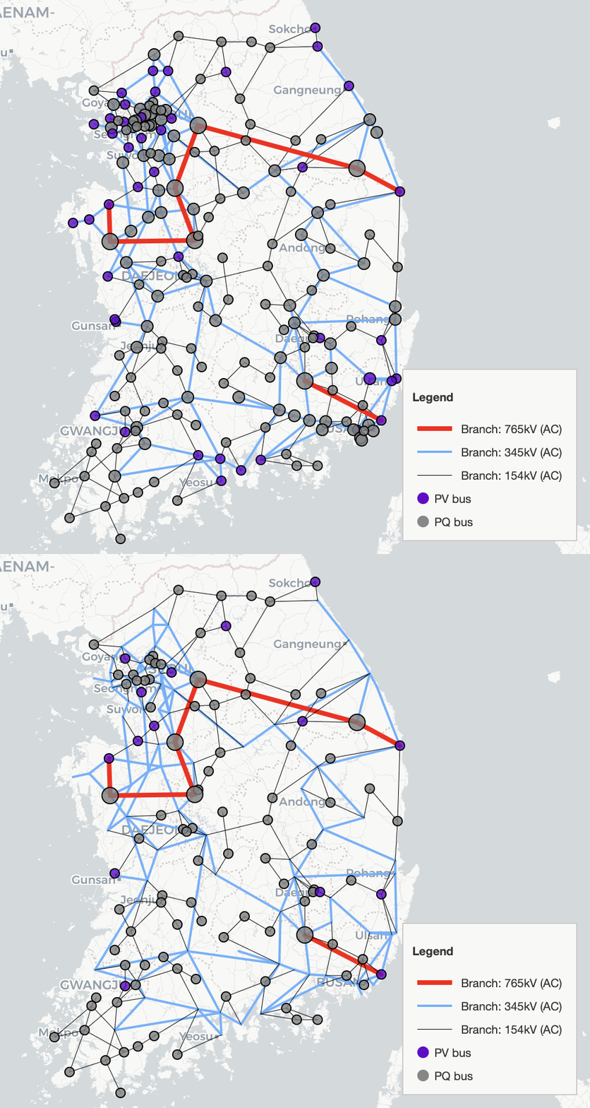
154 kV
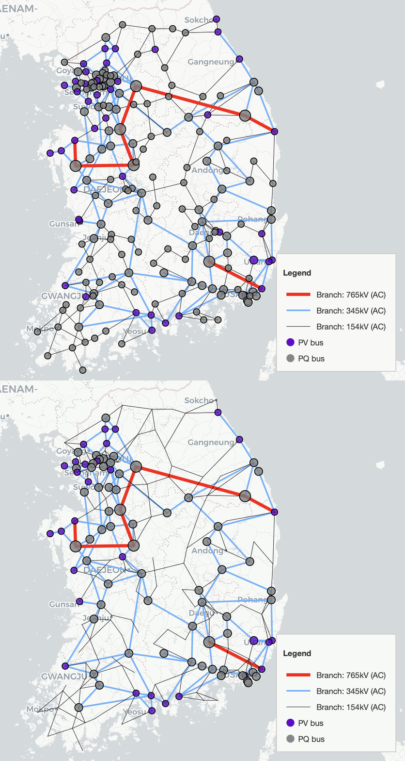
Service Status
Service status controls let you filter which components are displayed based on their in-service state.
For each component type (Bus, Generator, Lines), you can select one of:
ON: show only in-service / active elements
OFF: show only out-of-service / inactive elements
ALL: show both ON and OFF elements
3. Details/Selection
Select All Displayed
Add all currently visible elements to the selection list.
Clear List
Clear the selection list.
Reset Colors
Reset selection colors to defaults.
Preset
The Preset dropdown provides predefined groups (e.g., regional bus ranges, regional generators, and inter-area tie lines).
Selecting a preset automatically highlights and adds the corresponding elements to the selection list.
The example GIF below shows the 수도권 모선 (Bus 1–51) preset.
Pflow / Qflow
Use Pflow / Qflow to visualize branch power flows directly on the map.
This view corresponds to the values shown in the Branch popup (e.g., P Flow (MW) and Q Flow (MVAr)).
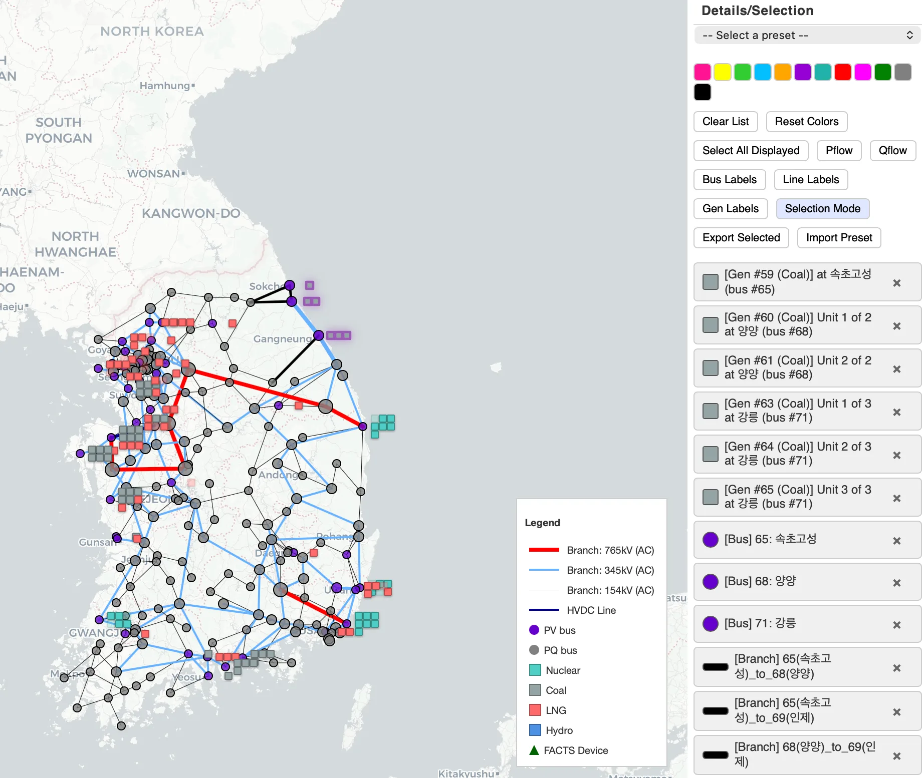
Labels (Bus/Line/Gen)
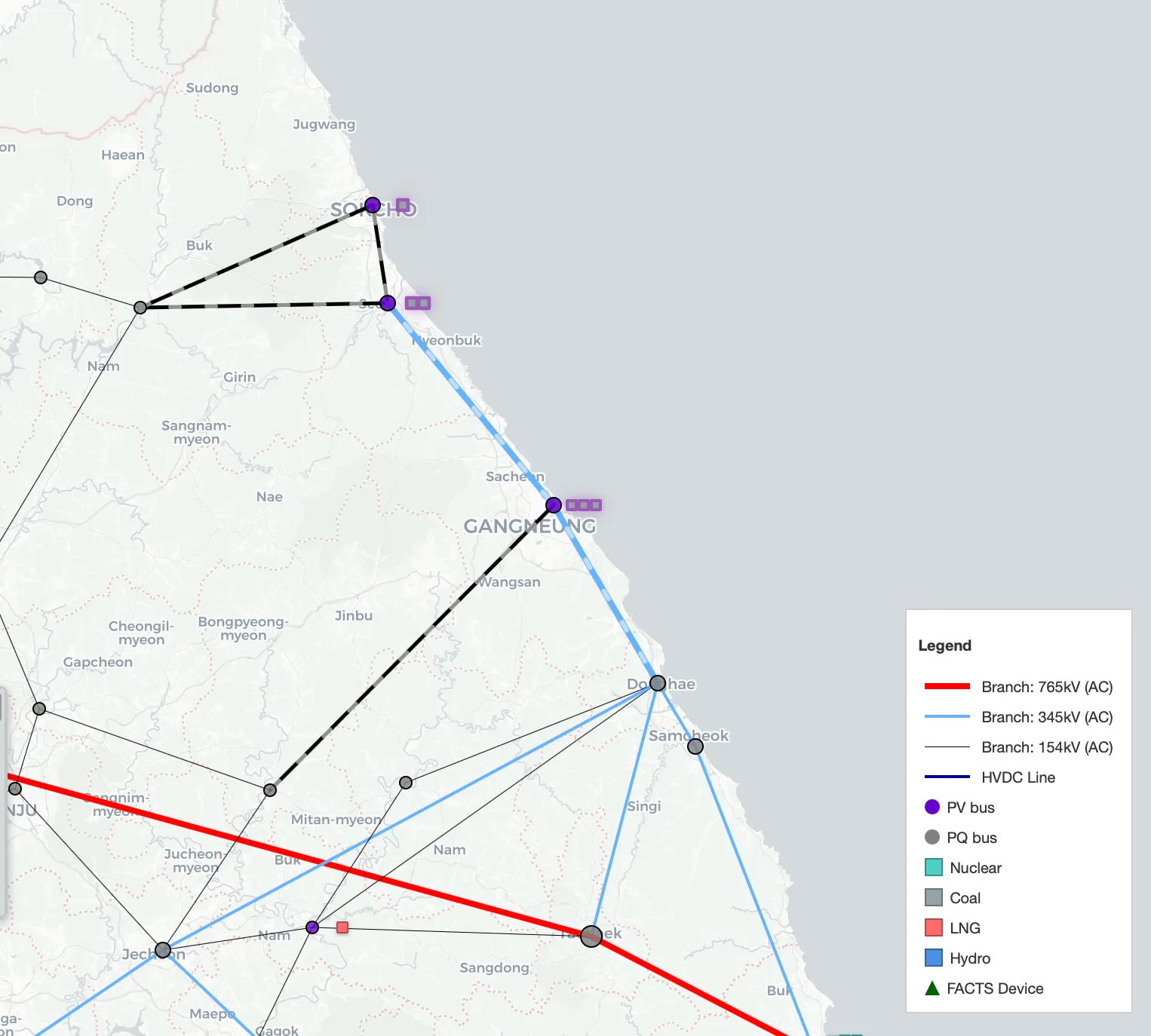
Use the label toggles to show names/IDs directly on the map (useful when zoomed in).
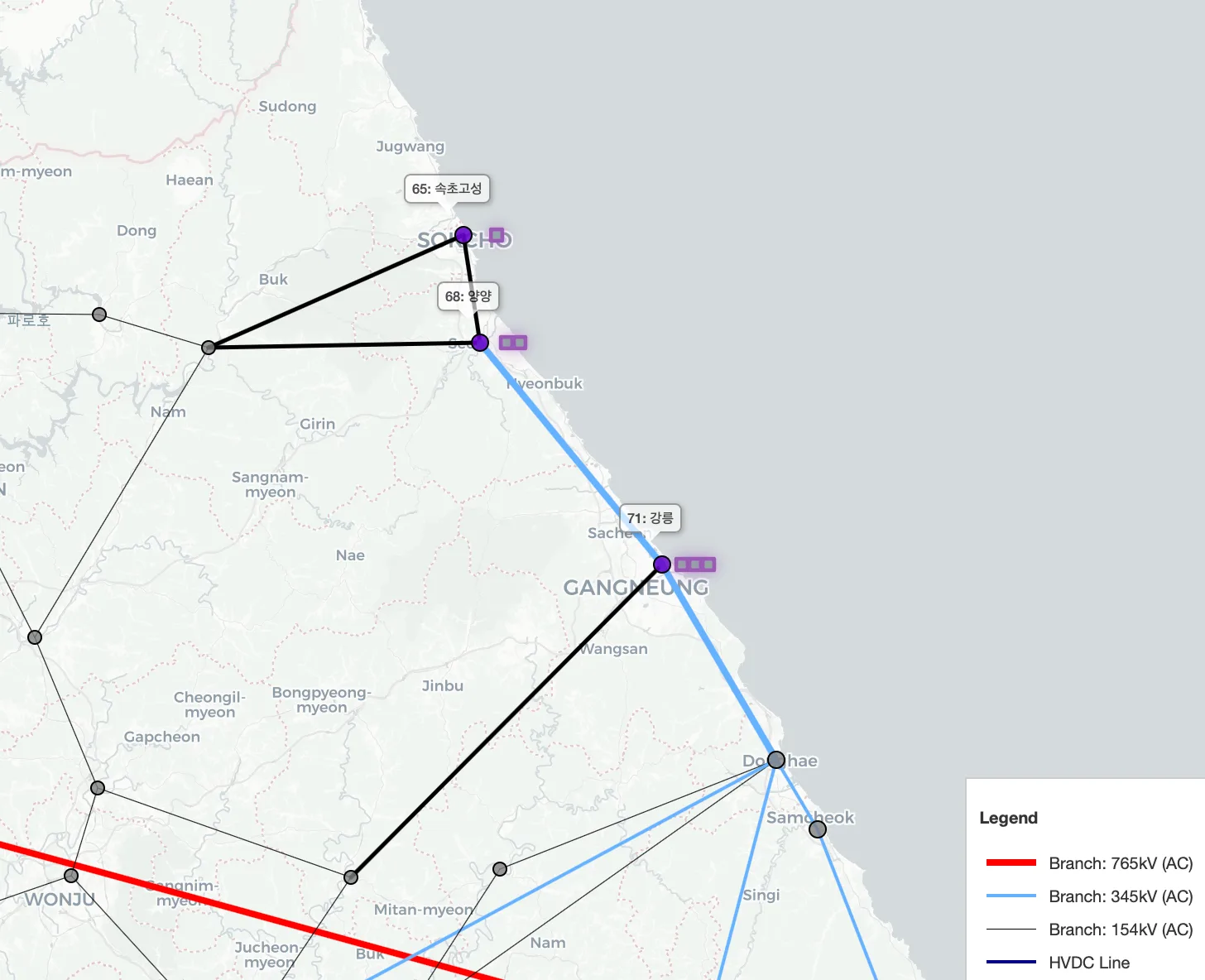
Bus labels show the bus ID and name (e.g.,
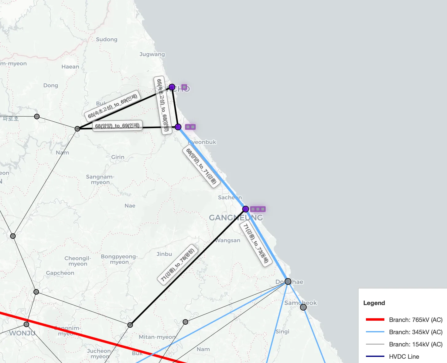
65: 속초고성).Line labels show the from/to endpoints (e.g.,
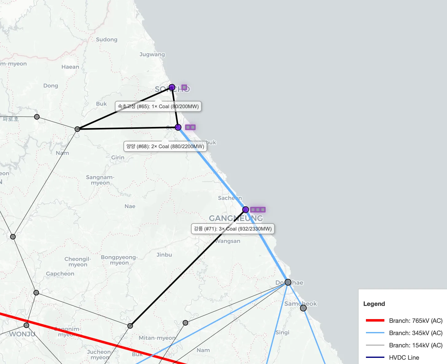
65(속초고성)_to_69(인제)).Generator labels summarize generators at a bus (e.g., number of units, fuel type, and MW output/capacity).
Bus Label
Line Label
Gen Label
Selection Mode
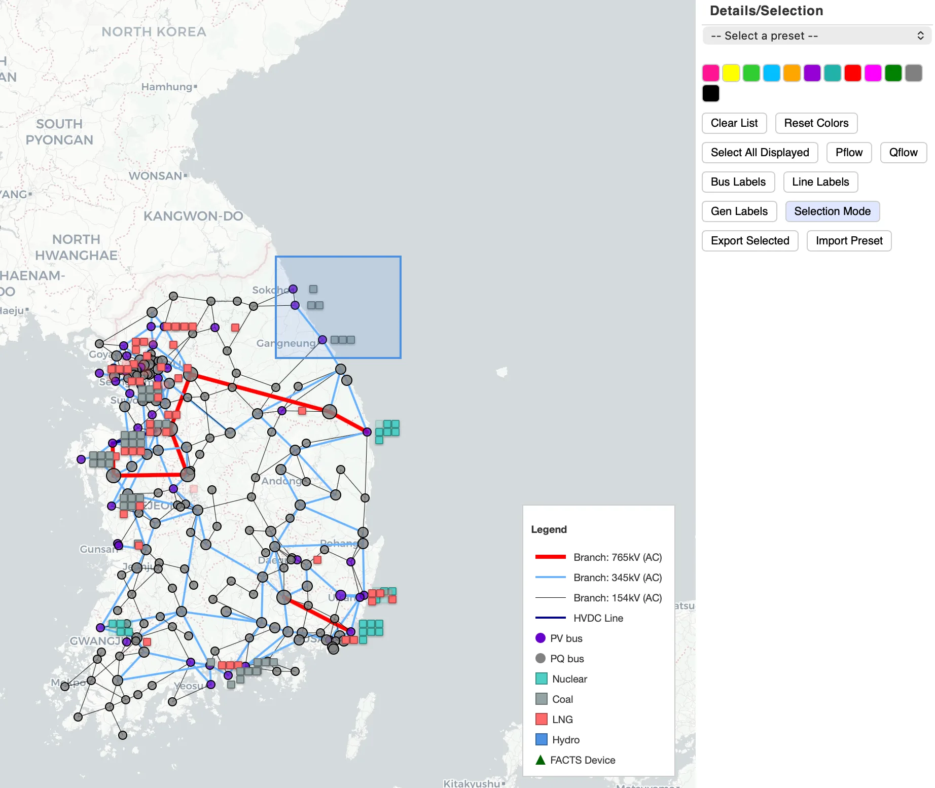
Selection Mode lets you select multiple elements directly on the map using a drag box (marquee selection).
Toggle it with V (see Help -> Keyboard Shortcuts).
Drag to draw a rectangle: all elements inside the box are added to the selection list on the right.
This is useful for quickly collecting a set of buses/branches/generators for exporting or focused analysis.
4. Economics & Fleet Monitor
Economics
Generation Mix: showing total generation by fuel type (hover to see each fuel’s output and share).
Total Generation: system generation for the selected hour/time step.
Major Generator: the highest-output generators to quickly identify dominant units.
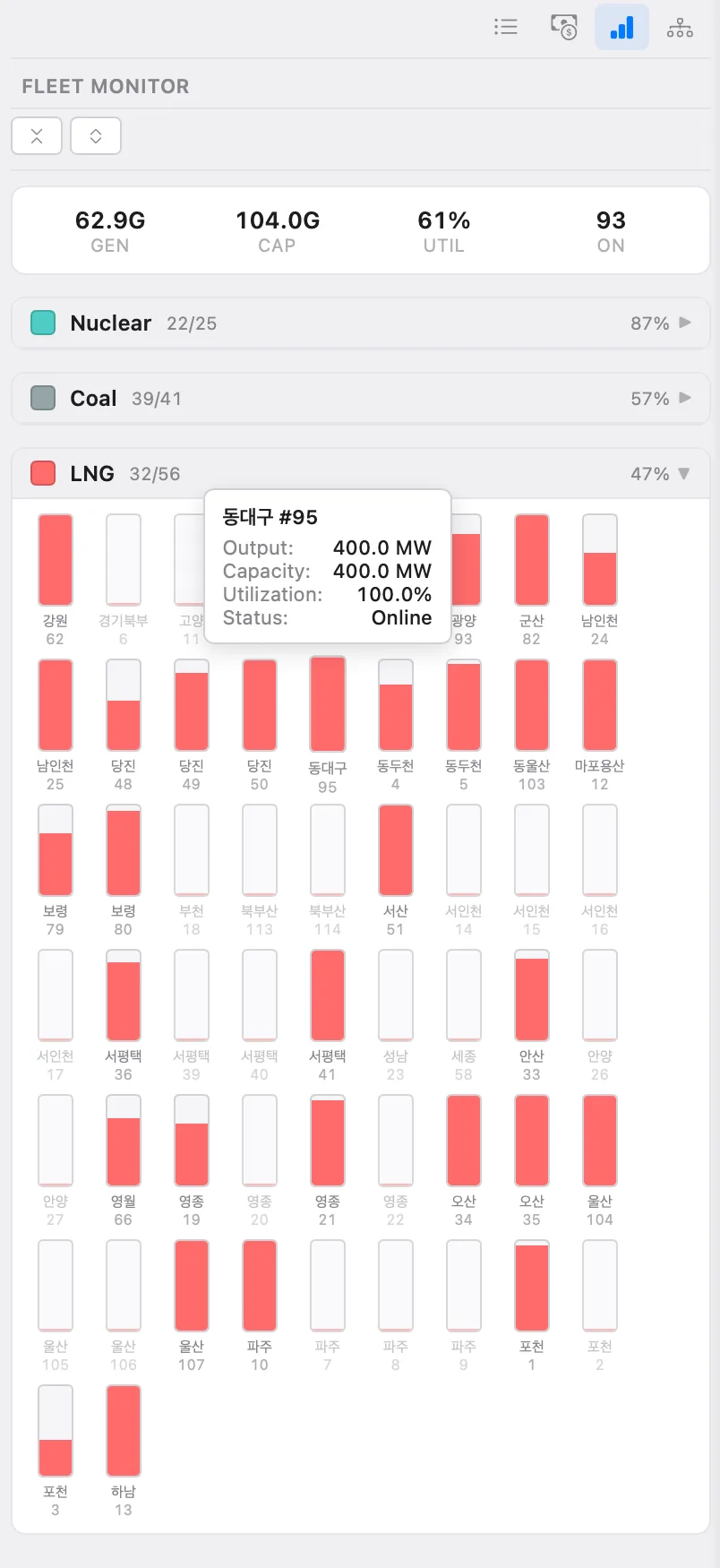
Fleet Monitor
Summary: quick KPIs for fleet status (total generation, total capacity, utilization, and number of online units).
Cap by Fuel Type: each unit is shown as a small bar where fill indicates current output vs capacity (hover for unit details).
Economics

Fleet Monitor
5. Bus Detail View
The Bus Detail View provides a compact “single-line” snapshot centered on a selected bus.
Enter the bus info: enter the bus and then it shows the selected bus in the center and all directly connected neighboring buses/branches.
Branch loading: each connected branch displays a loading bar (%), matching the line-loading concept used on the main map.
P/Q flow direction and magnitude: arrows indicate flow direction; numeric values show the corresponding P (MW) and Q (MVAr) on each side of the branch.
Bus Detail View